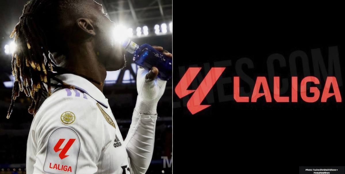
A comprehensive rebrand is in store for La Liga, as it collaborates with EA Sports in the 23/24 season.
In conjunction with this alliance, La Liga will introduce a new emblem and adopt the name “LaLiga EA Sports FC” starting next season.
That'll replace the current name, “La Liga Santander.” The latter, a bank, is often an afterthought to most fans who consider the league name.
LaLiga logo adopts a curious red hue 🤨
The updated LaLiga emblem abandons the iconic color wheel that has been a fixture for three decades. In its place, the revamped logo showcases a subtle red hue. And an enigmatic “ll” symbol enters the fray.
Note that there's still no space between “LaLiga”- a decision made in 2016 as part of the league's rebranding efforts. The league name also gets capitalized for the upcoming 2023/24 season.
Below is a kit mock-up of the league badge on Real Madrid's Eduardo Camavinga. The imprint will go on all team kits.
Fans have expressed outrage over the redesign. Others think the new design will still have zero impact on competing with the Premier League.
“Somethings are better unchanged. That former logo represents some sort of spanish culture/royalty,” tweeted @kays_room.
“They finally accepted to be farmers?” said another.
“It will still fail as a league as most of the new money will still go to 2 teams. They don't care about other teams which is why their league is in this mess. It should be called the LaLiga Biased League,” tweeted one fan.
Which league logo do you think is best? Let us know on Twitter.
Photo: Twitter/theMadridZone + FootyHeadlines